Vrij Nederland
2018
Discover more
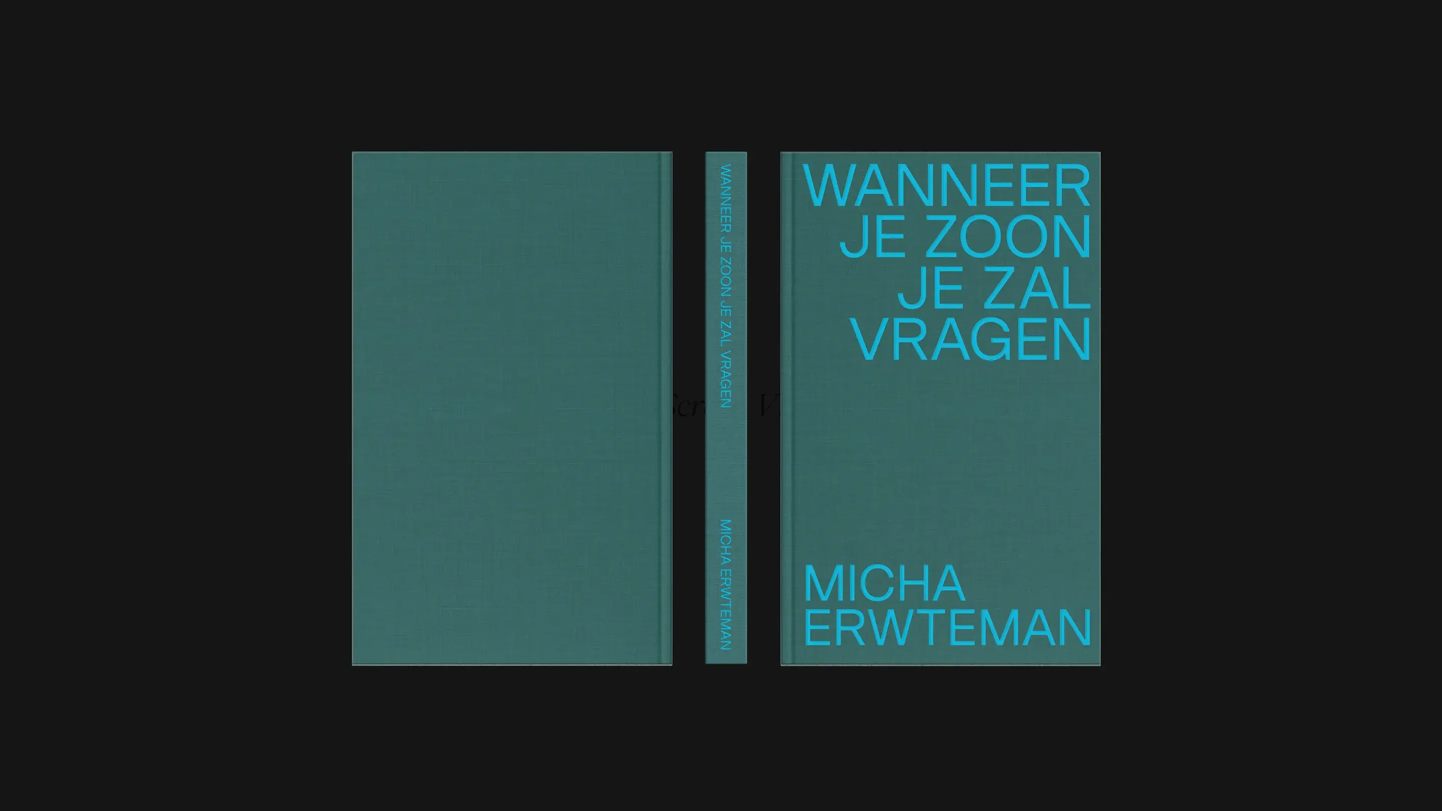
Micha Erwteman
Branding,
Web design,
Packaging
Divano Lounge
Branding,
Web design,
Print design,
Editorial
Atelier Mier
Branding,
Web design,
Packaging
2018
Branding,
Web design,
Packaging
Branding,
Web design,
Print design,
Editorial
Branding,
Web design,
Packaging
About
The creation of a new graphic language around the theme ‘freedom’ for an already iconic journalist magazine.
Vrij Nederland is a well known, Dutch journalist magazine that was born from resistance during the 1940’s. Teamed up with PUP creative agency - Studio Morf developed a new graphic identity based around the theme of ‘freedom’ and that blends modernity with historical roots. Looking both towards the future, but also clutching back to old times and the attitude that once initiated this strong-minded resistance magazine
Client
PUP creative agency
Services
Branding, Web Design, Print implementation


A restrained yet warm publication that balances explanation and emotion, offering language for tradition, doubt, and lived religion.
Shaping a bold and limitless identity and digital presence that embodies freedom, adaptability, and global ambition.
Jewellery inspired by nature, crafted with refinement, and designed to be worn close to the skin.


