Shift towards tactility

Shift towards tactility

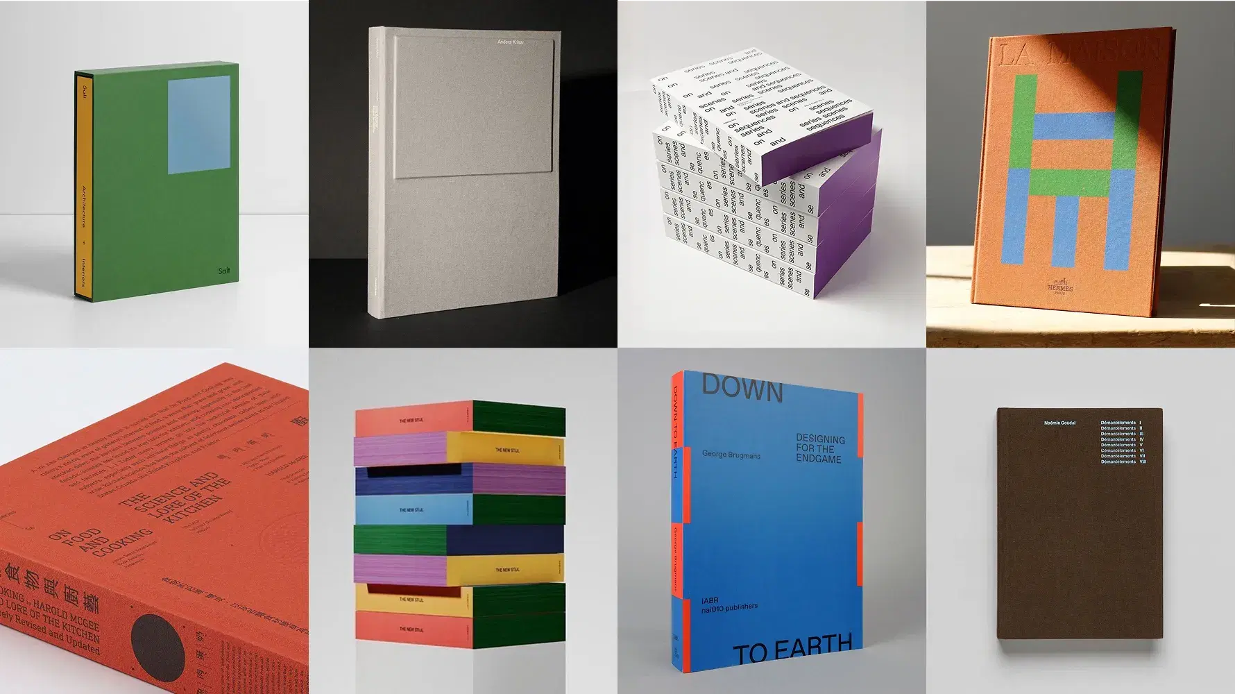
A collage of nine book covers, each with unique, minimalist designs and varied color schemes, against a neutral background.
Date

2 March 2026

Written by

Mania - Creative Design Intern

As reading increasingly takes place on screens, the physical book is experienced differently — not for speed or convenience, but for its material presence: how it feels, how it behaves, how it ages through use.

Attention shifts toward tactile design choices — binding, surface, paper, edges, structure, and scale — which shape how a book is first encountered and how it continues to exist as it is carried, stored, returned to, and remembered, often before any text is read. There are books you carry, books that remain close, books you admire, and books you simply want to have. They are rarely experienced in a linear way. Often, the first encounter is not reading at all, but noticing a spine, feeling the weight, or opening the book only slightly.

Looking toward 2026, book design increasingly treats tactility not as an aesthetic layer, but as a way of shaping experience. The following trends reflect this growing attention to physical encounter, in contrast to the immaterial nature of digital reading.
TREND O1

Material Identity

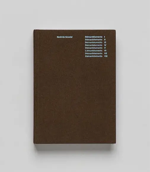
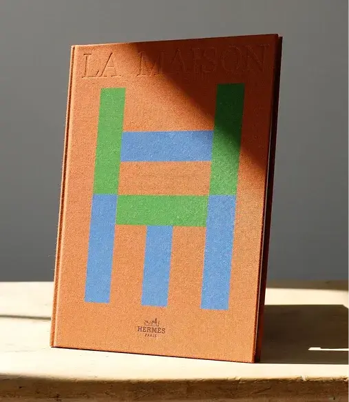
Fabric covers are emerging as a key design choice that communicates quality and presence from the first touch. Linen, canvas, and woven textiles offer immediate tactile feedback, signaling durability, care, and usability before a reader opens the book.

Unlike coated or smooth surfaces, fabric changes how a book is handled: it provides grip, invites repeated use, and reinforces the book as an object to live with. In this way, the cover itself becomes an entry point — shaping the first encounter and setting the tone for the experience that follows.

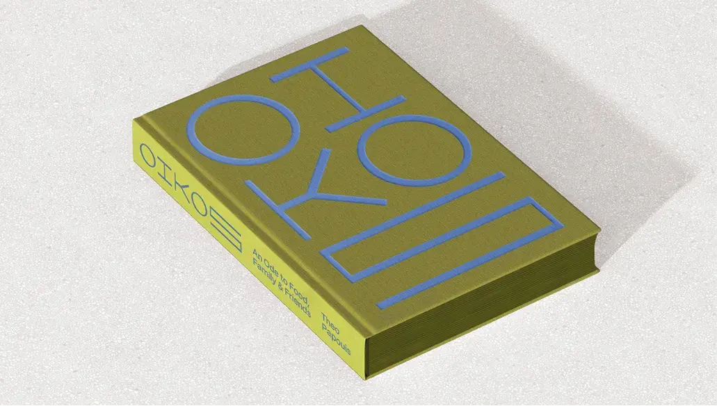
PHOTO 01

Oikos – An Ode to Food, Family and Friends by Theo Papouis.
Published by Oikos, 2024.

Olive green book with bold, light blue geometric text on the cover and spine, placed on a neutral surface.

PHOTO 02

DÉMANTÈLEMENTS by Noémie Goudal
Published with the support of Photo Elysée (Lausanne) and LUX Scène nationale de Valence.

PHOTO 03

La Maison by Les Graphiquants.
Published by Hermès Paris, 2022.

Brown book cover with white text listing "Démantèlement I-VIII" and the author's name, Noémie Goudal, in the top left corner.
A book titled "LA MAISON" with an abstract H design on the cover, standing on a table in soft natural light.

TREND O2

Surface Tactility

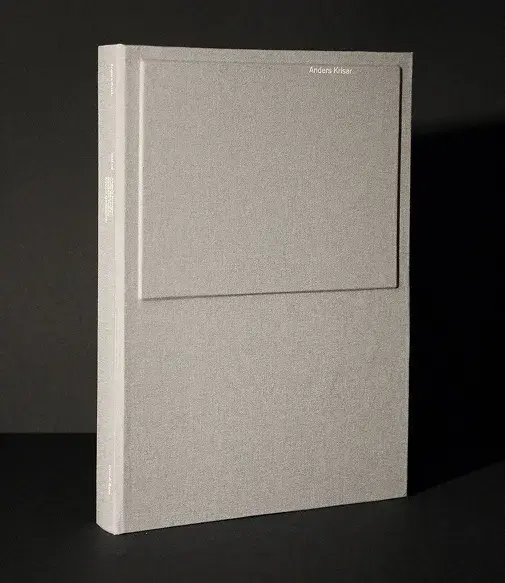
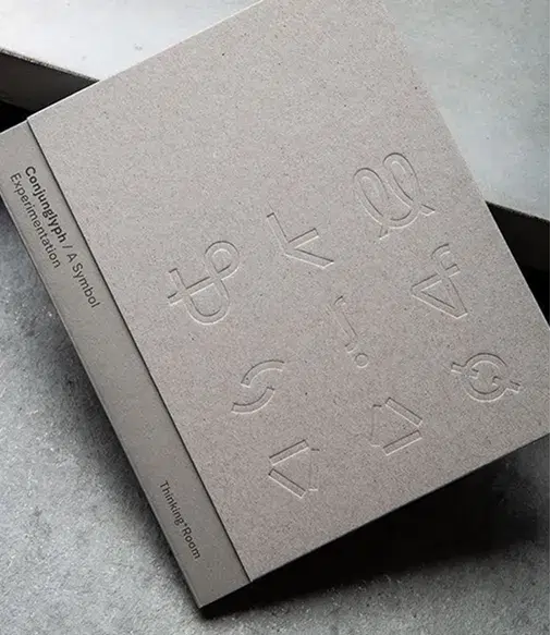
Covers increasingly rely on tactility rather than image alone. Pressed, debossed, or blind-stamped elements create surfaces that invite touch before reading. Because books are held close to the body, surface decisions shape familiarity and comfort.

These covers are not designed to be read from a distance, but to be experienced through handling. Touch becomes an early form of engagement — another entry point into the book.

PHOTO 01

Anders Krisár: Sculpture by
Anders Krisár.
Published by Krisar Projects, 2022.

PHOTO 02

Conjunglyph: A Symbol Experimentation by Thinking Room.
Published by Thinking Room, 2021.

Gray book standing on a dark surface, featuring a minimalistic cover with a subtle raised rectangular design and small white text on the spine.
Minimalist book cover with embossed abstract symbols and text reading "Country Rap #4: A Symbol Experimentation" and "Thinking Room" on the spine.

TREND O3

Ritual Objects

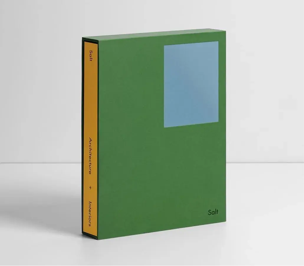
Some books introduce an additional layer between the reader and the content. Slipcases, folded enclosures, and protective structures slow down access and create a small moment of retrieval.


These forms acknowledge that books are not only opened, but stored and returned to. The act of taking a book out becomes part of the experience, reinforcing its presence as an object rather than a container of text.

PHOTO 01

Salt Architecture by McCarthy Studio.
Published by Salt Architecture + Interiors, 2023.

Green book with a blue square cover and yellow spine, titled "Salt: Architecture + Interiors".

TREND O4

Shelf Signatures

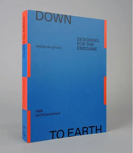
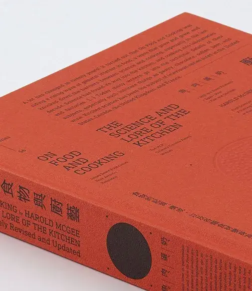
For many books, the spine is the most frequently encountered surface. It is read on shelves, in stacks, and in digital listings long before the cover is seen.

Designers increasingly treat the spine as a primary communication space. Clear typography, proportion, and contrast allow books to be recognized without being opened. The spine becomes a tactile and visual cue, guiding both choice and memory.

PHOTO 01

Down to Earth: Designing for the Endgame by George Brugmans.
Published by NAI010 Publishers, 2023/2024. 

PHOTO 02

On Food and Cooking: The Science and Lore of the Kitchen by Harold McGee
Published by Scribner, 2004

Blue book titled "Down to Earth: Designing for the Endgame" by George Brugmans, with orange accents. Published by nai010 publishers.
Orange book titled "On Food and Cooking: The Science and Lore of the Kitchen" by Harold McGee, featuring various texts on the cover.

TREND 05

Responsive Materials

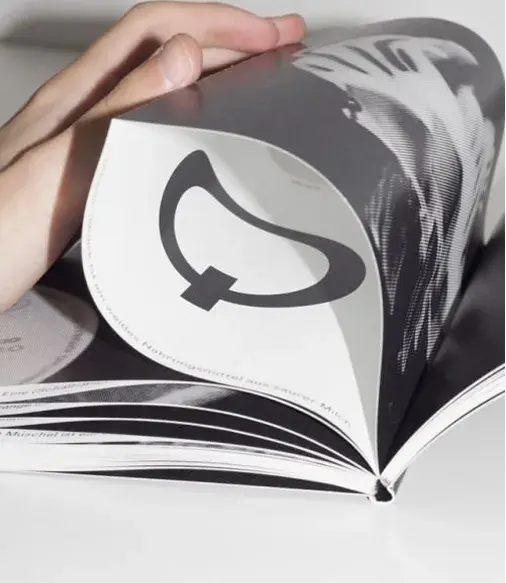
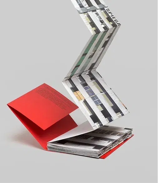
Paper is used not only as a carrier of content, but as a material that shapes interaction. Folding, cutting, layering, and variation in thickness influence how a book is opened, navigated, and held.

These decisions affect orientation and movement rather than reading order. The reader encounters the book spatially, through gestures and handling, reinforcing the idea that experience does not begin with the first page.

PHOTO 01

PHOTO 02

Corpi di Reato by Tommaso Bonaventura, Alessandro Imbriaco, Fabio Severo
Published by Tomo Tomo, 2018.

Hand flipping through a black-and-white magazine, displaying a page with a bold, abstract symbol.
Accordion-style foldout with architectural images, attached to a partially open red-covered book on a plain background.

TREND 06

Edge Expression

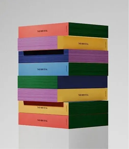
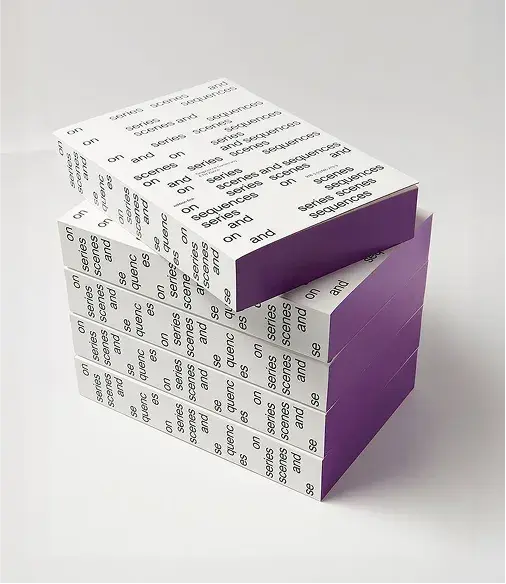
Decorated or colored page edges appear when books are closed, stacked, or carried. They are encountered incidentally — often before any deliberate engagement.

By treating the edge as a designed surface, designers acknowledge how books exist in space. The object communicates from multiple angles, reinforcing the idea that a book is experienced from multiple perspectives.

PHOTO 01

THE NEW STIJL by MENDO & ...,staat (Amsterdam)
Published by MENDO & ...,staat, 2022

PHOTO 02

On Series: Senses and Sequences.
Published by Lars Müller Publishers, 2017.

A stack of colorful books with plain covers in pink, green, and other shades. The books are labeled "The New Stil."
Stacked books with white covers featuring repeated text, "on sense and sens," and purple spines, displayed against a white background.

Taken together, these trends point to a broader shift in book design. As reading increasingly moves into digital space, the physical book is defined less by access to content and more by experience.

In 2026, books are designed as objects with many entry points. Through structure, surface, paper, and detail, they establish presence before reading begins. Tactility becomes a way of shaping first encounters and all the encounters that follow — as books are carried, noticed, returned to, and remembered.


More stories

→View all→
Safecourt campagne street board with photography and graphic design
8 March 2026

5 signs your brand is ready for Rebranding

You’ve been building your business for years, with care, ambition, and a deep sense of commitment. Your offer is solid, your experience keeps growing, and your vision is clearer than ever. And yet, it feels like your message isn’t fully landing. As if people don’t quite see what you see.

White packaging ikkari
18 February 2026

Packaging Design Trends 2026 Material Presence

In a world dominated by screens and digital imagery, physical packaging is reclaiming its power as an experiential object. Consumers rarely encounter products only through online images — the first interaction often happens on the shelf, in the hand, or through subtle sensory cues.

Brown and white tiles arranged in a grid pattern, creating an abstract design with alternating vertical stripes.
17 February 2026

Our favourite Colours & Combinations for 2026

Colour often seems like a detail at first. Something aesthetic you can decide on later. But in reality, colour is the first thing you feel, long before you understand it. Before someone reads your brand, colour has already set the tone. Whether it feels right or slightly off. It’s intuitive, immediate, and more defining than we often realise. In 2026, colour is less about rules and more about feeling. About combinations that create tension, find balance, and express something distinctive.