2 March 2026
Shift towards tactility
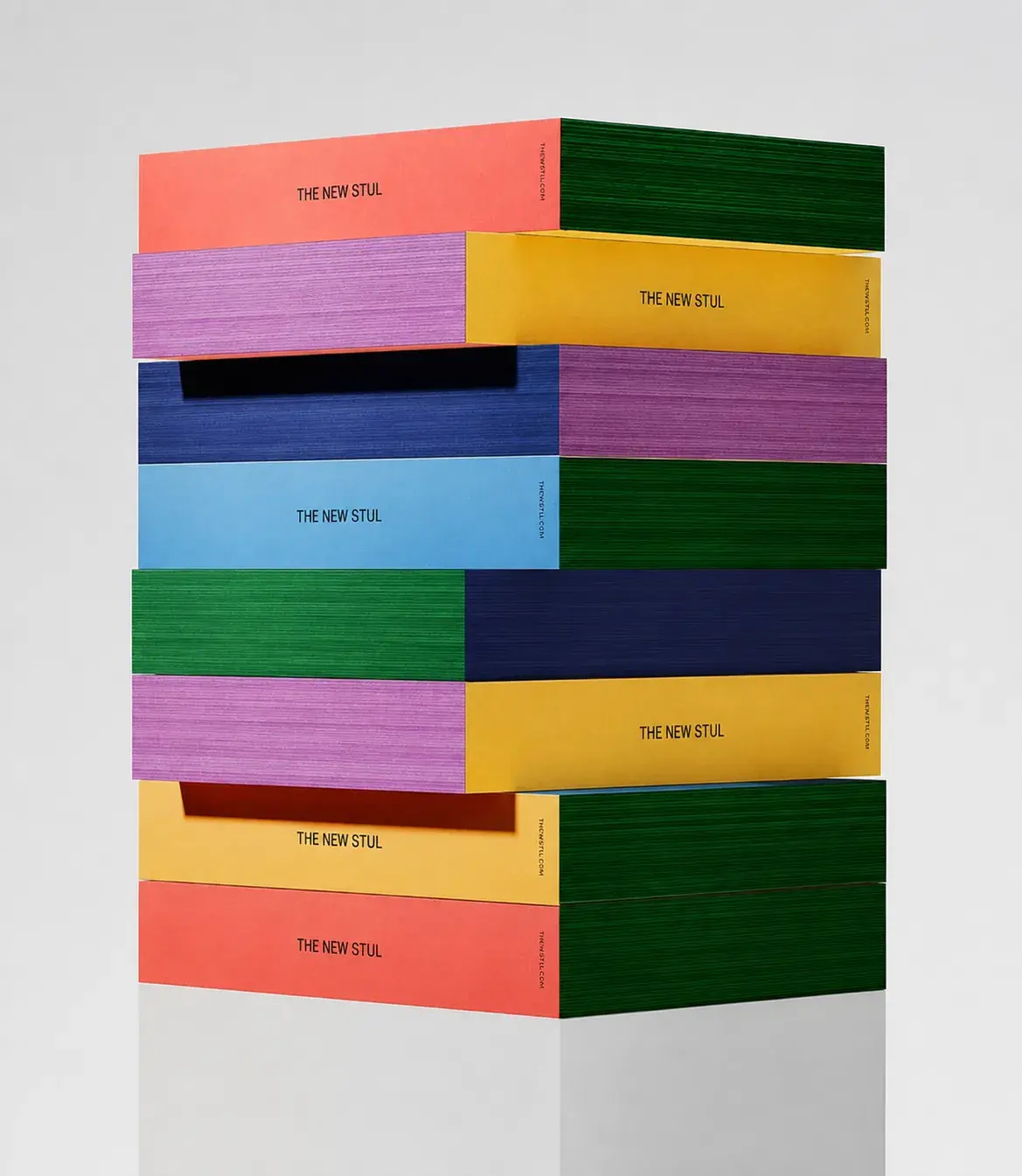
As reading increasingly takes place on screens, the physical book is experienced differently — not for speed or convenience, but for its material presence: how it feels, how it behaves, how it ages through use.
Packaging Design Trends 2026
Material Presence
18 February 2026
Mania - Creative Design Intern
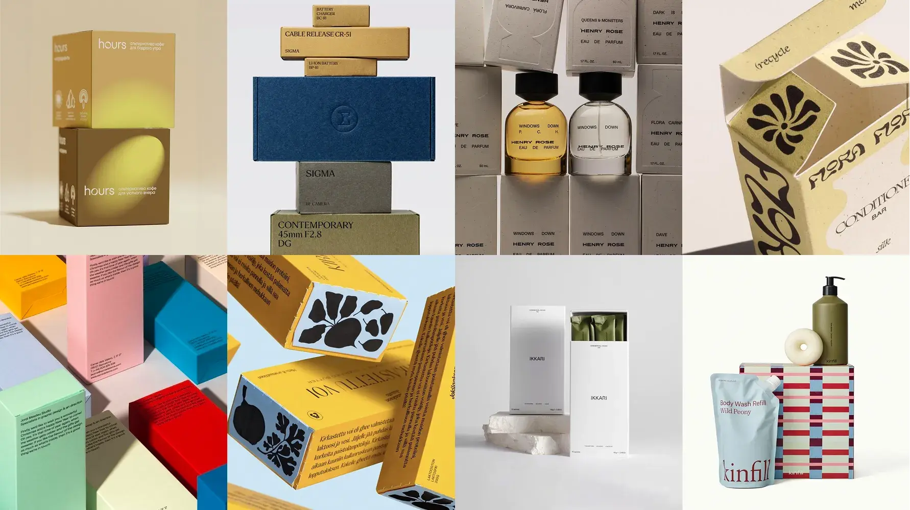
In a world dominated by screens and digital imagery, physical packaging is reclaiming its power as an experiential object. Consumers rarely encounter products only through online images — the first interaction often happens on the shelf, in the hand, or through subtle sensory cues.
TREND O1
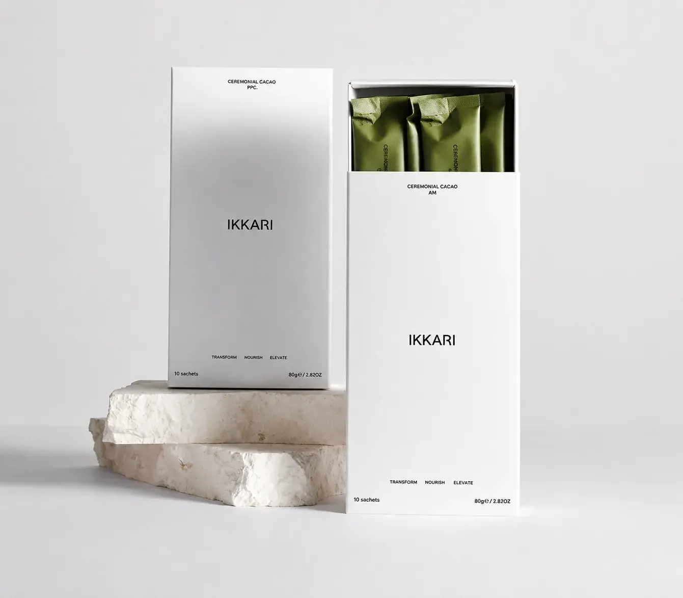
Clean, calm designs with tactile finishes and restrained color palettes convey premium value without shouting for attention. Minimalist packaging allows material quality, form, and texture to do the talking, creating a sense of calm and sophistication on the shelf.
This trend favors subtle embossing, matte or soft-touch finishes, and thoughtful typography — details that reward handling and encourage consumers to pick up and interact with the product, rather than just scanning it from a distance.
PHOTO 01
IKKARI
TREND O2
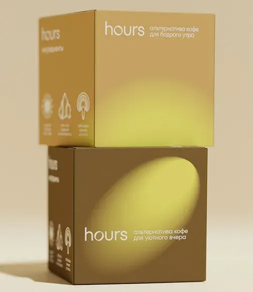
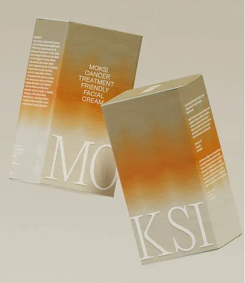
Warm, nostalgic hues and classic craft references paired with modern layouts create a sense of comfort and familiarity. Designers are exploring gradient colors, soft tonal shifts, and retro-inspired typography, bridging traditional craft and contemporary sensibilities.
Packaging in this category often evokes memory or familiarity while still feeling current, creating a first encounter that feels personal and approachable. Gradients add depth and layering, giving surfaces a tactile perception even before touch.
PHOTO 01
FLORA FLORA
PHOTO 02
APOTICARI
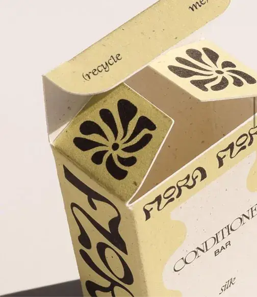
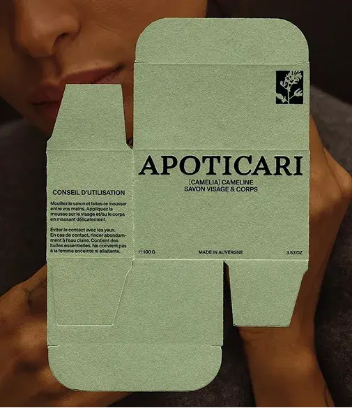
PHOTO 3
SIGMA
PHOTO 4
Jokilaakson Juusto
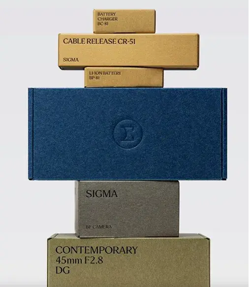
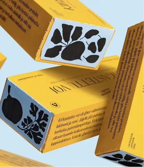
PHOTO 5
hours
PHOTO 6
MOKSI
TREND O3
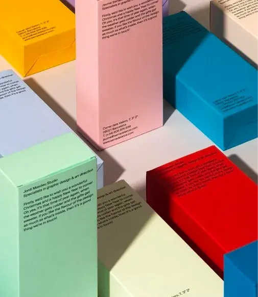
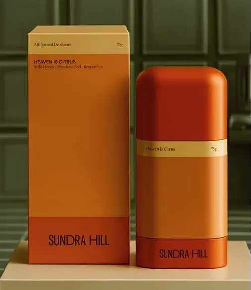
Bold, high-contrast colors act as focal points to improve shelf impact. In crowded retail environments, strategic color use guides attention and signals brand personality instantly. Color here is not just aesthetic —
it is functional, acting as a visual anchor and creating recognizable touchpoints for consumers across multiple retail contexts, both physical and digital.
PHOTO 01
Mr. Bucket
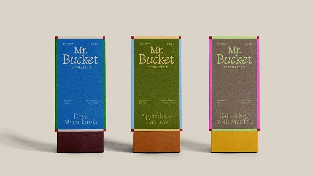
PHOTO 02
Jordi Masdeu Studio
PHOTO 03
SUNDRA HILL
TREND 04
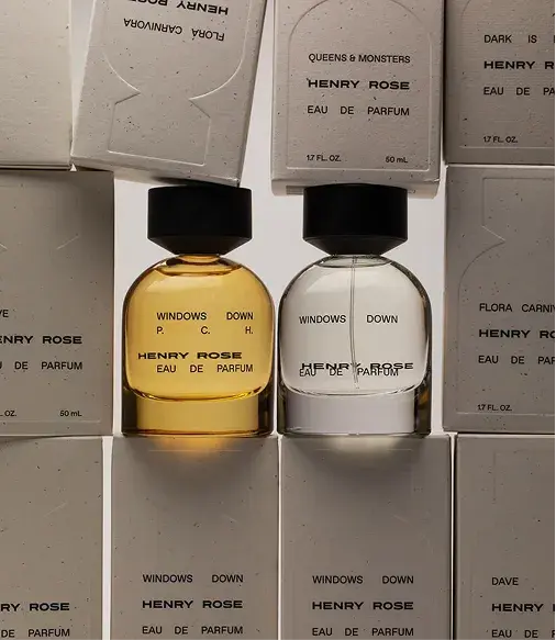
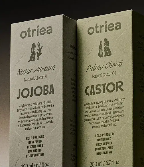
Textural surprises — soft-touch laminates, embossing, debossing, and layered surfaces — make packaging a multi-sensory experience. Touch becomes part of the brand language, reinforcing premium perception and material presence.
These tactile features create entry points for engagement, inviting consumers to hold, explore, and return to the product, making the packaging itself a living part of the experience, not just a container.
PHOTO 1
HENRY ROSE
PHOTO 2
otriea
TREND O5
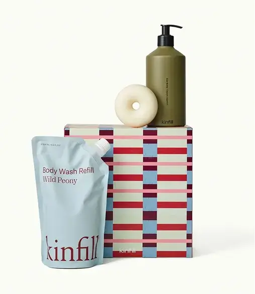
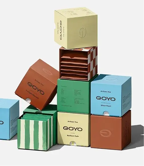
Patterned surfaces, repeated motifs, or structural graphics provide instant recognition and narrative cues. Like tactile or color decisions, patterns guide interaction: a repeated motif can hint at flavor, origin, or brand identity before any text is read.
Patterns also allow designers to balance boldness with subtlety — creating packaging that is memorable in passing, but rewarding up close. This makes pattern an increasingly central tool in 2026 for bridging visual impact and tactile experience.
PHOTO 1
kinfill
PHOTO 2
GOYO
“Real branding lives deeper. It’s the feeling people get before they’ve fully read your website. The confidence (or hesitation) they sense when they scroll your feed. The quiet click of recognition when something just feels right.”
As reading increasingly takes place on screens, the physical book is experienced differently — not for speed or convenience, but for its material presence: how it feels, how it behaves, how it ages through use.
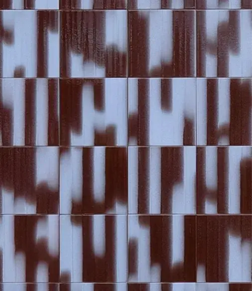
Colour often seems like a detail at first. Something aesthetic you can decide on later. But in reality, colour is the first thing you feel, long before you understand it. Before someone reads your brand, colour has already set the tone. Whether it feels right or slightly off. It’s intuitive, immediate, and more defining than we often realise. In 2026, colour is less about rules and more about feeling. About combinations that create tension, find balance, and express something distinctive.

Branding is often reduced to visuals. A logo. A colour palette. A font choice. Important, yes – but that’s only the surface. Real branding lives deeper. It’s the feeling people get before they’ve fully read your website. The confidence (or hesitation) they sense when they scroll your feed. The quiet click of recognition when something just feels right. Branding is not decoration. It’s direction.