2 March 2026
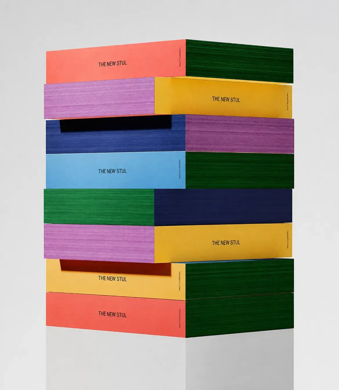
Shift towards tactility
As reading increasingly takes place on screens, the physical book is experienced differently — not for speed or convenience, but for its material presence: how it feels, how it behaves, how it ages through use.
Our work spans design,
development, and strategy.
As reading increasingly takes place on screens, the physical book is experienced differently — not for speed or convenience, but for its material presence: how it feels, how it behaves, how it ages through use.
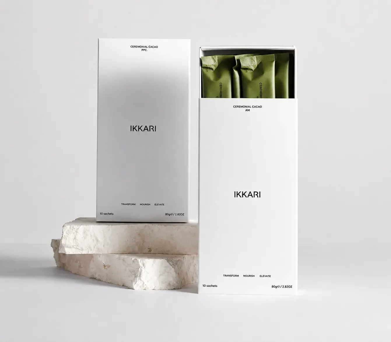
In a world dominated by screens and digital imagery, physical packaging is reclaiming its power as an experiential object. Consumers rarely encounter products only through online images — the first interaction often happens on the shelf, in the hand, or through subtle sensory cues.
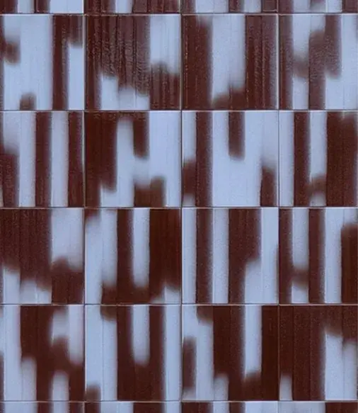
Colour often seems like a detail at first. Something aesthetic you can decide on later. But in reality, colour is the first thing you feel, long before you understand it. Before someone reads your brand, colour has already set the tone. Whether it feels right or slightly off. It’s intuitive, immediate, and more defining than we often realise. In 2026, colour is less about rules and more about feeling. About combinations that create tension, find balance, and express something distinctive.

Branding is often reduced to visuals. A logo. A colour palette. A font choice. Important, yes – but that’s only the surface. Real branding lives deeper. It’s the feeling people get before they’ve fully read your website. The confidence (or hesitation) they sense when they scroll your feed. The quiet click of recognition when something just feels right. Branding is not decoration. It’s direction.