2 March 2026
Shift towards tactility
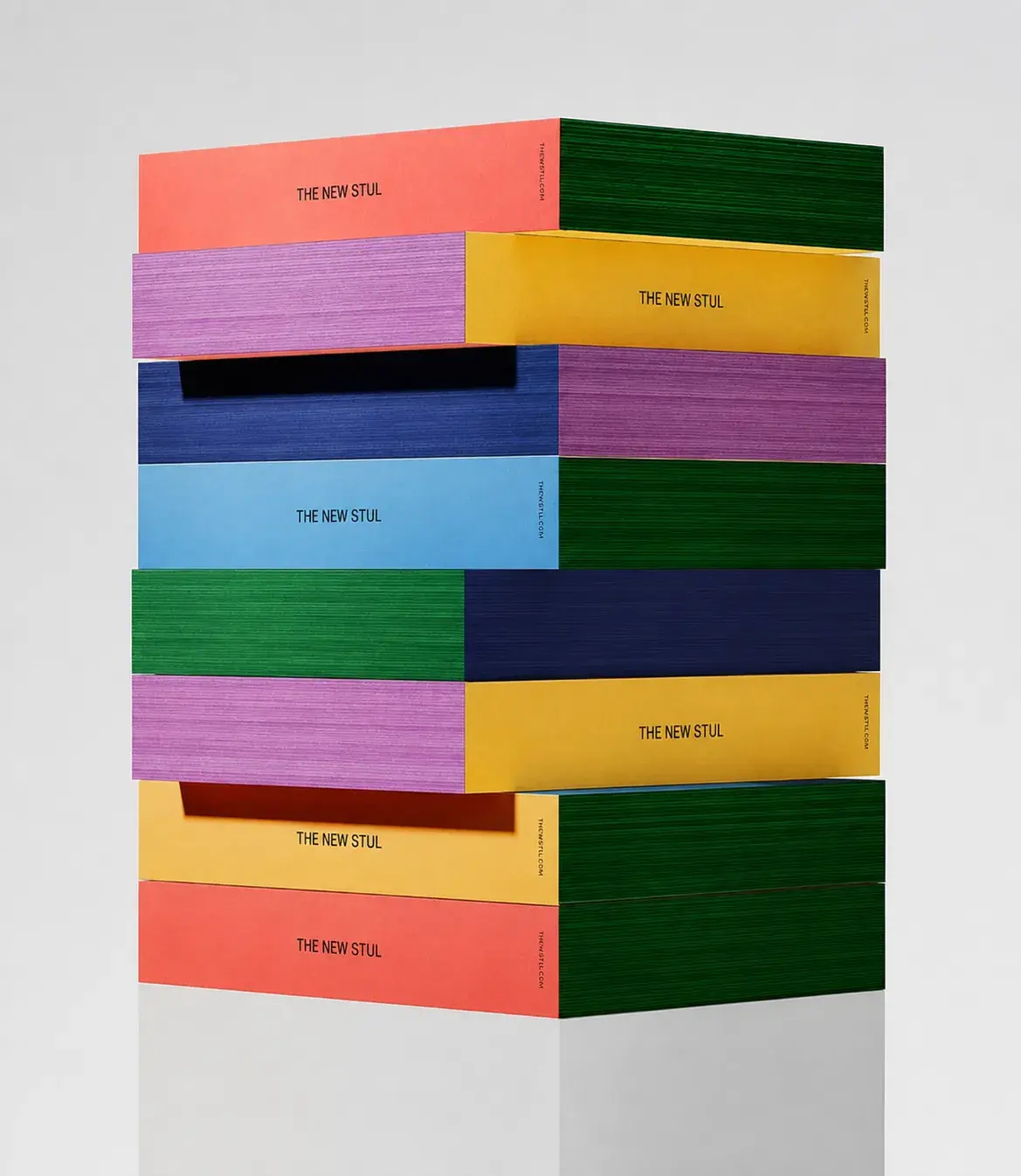
As reading increasingly takes place on screens, the physical book is experienced differently — not for speed or convenience, but for its material presence: how it feels, how it behaves, how it ages through use.
Our favourite Colours &
Combinations for 2026
17 February 2026
Hannah - Creative Social Intern
Colour often seems like a detail at first. Something aesthetic you can decide on later. But in reality, colour is the first thing you feel, long before you understand it. Before someone reads your brand, colour has already set the tone. Whether it feels right or slightly off. It’s intuitive, immediate, and more defining than we often realise.
In 2026, colour is less about rules and more about feeling. About combinations that create tension, find balance, and express something distinctive.
COLOUR O1
This colour feels open and airy, yet never empty. It brings a sense of lightness and clarity to a brand, without becoming distant. It creates a quiet sense of trust, offering a calm foundation where ideas, details, and expression can truly come forward.
PHOTO 01
Poshculture
PHOTO 02
Lelive.
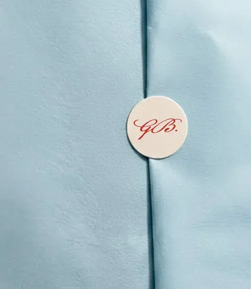
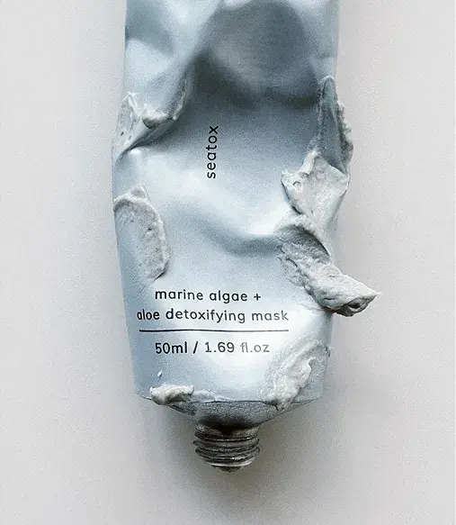
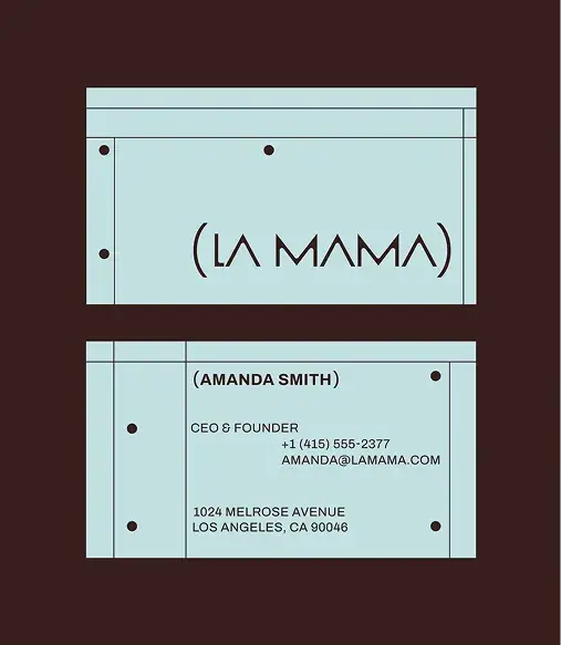
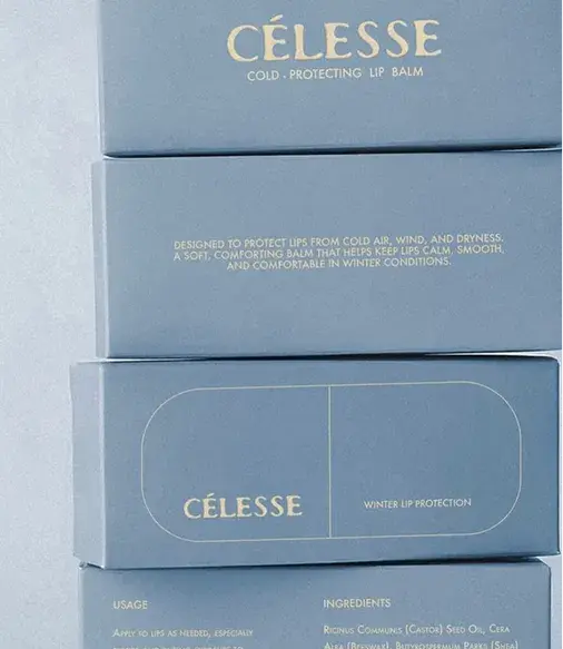
Paired with burgundy, one of our other favourites, it creates a balance between softness and contrast.
The freshness of light blue keeps things accessible, while burgundy adds depth and character. Together, it feels balanced, with just enough tension to stay interesting without becoming harsh.
PHOTO 3
Studio GDB
PHOTO 4
Marka Works
COLOUR O2
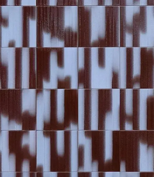
This colour feels steady and honest, without becoming heavy. It adds depth and authenticity to a brand, and works especially well when combined with softer or lighter tones. It grounds the palette with a sense of warmth and richness, creating a balanced contrast that feels both refined and approachable.
PHOTO 01
Dots Creative Studio - Molly Rube
PHOTO 2
KB STUDIO
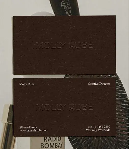
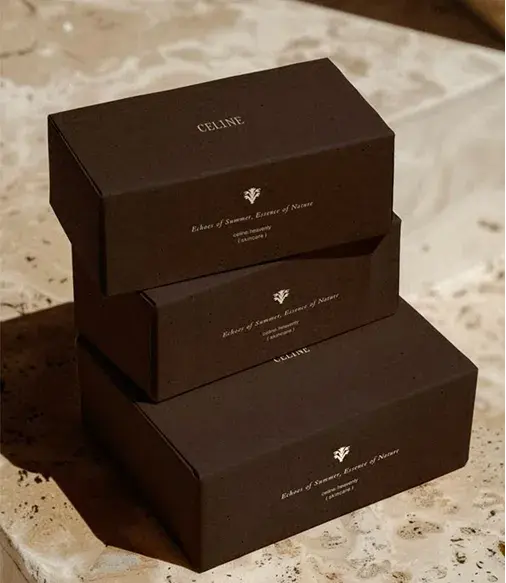
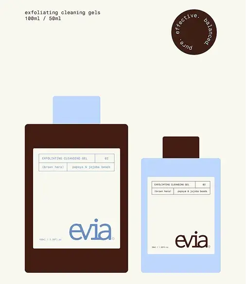
Brown pairs beautifully with fresh and light colours to create contrast. Think light blue or soft yellow. Light blue brings air and clarity, while brown adds calm and depth. Together, it feels balanced, natural, and sincere, with a subtle tension that never overwhelms. Combined with a soft yellow tone, brown creates a sense of stability, while the yellow lifts and lightens the palette. The result feels approachable and warm, without becoming too bright.
PHOTO 3 - Evia
allophysm
PHOTO 04
KÆK

COLOUR 03
Burgundy feels rich and understated at the same time. It immediately adds weight and character to a brand, while remaining soft enough to feel accessible. It brings a quiet sense of warmth and depth, creating a grounded foundation that elevates the overall palette without overpowering it.
PHOTO 01
Alice Chachka - Marié Ola
PHOTO 02
Karolina Król - Yin Matcha
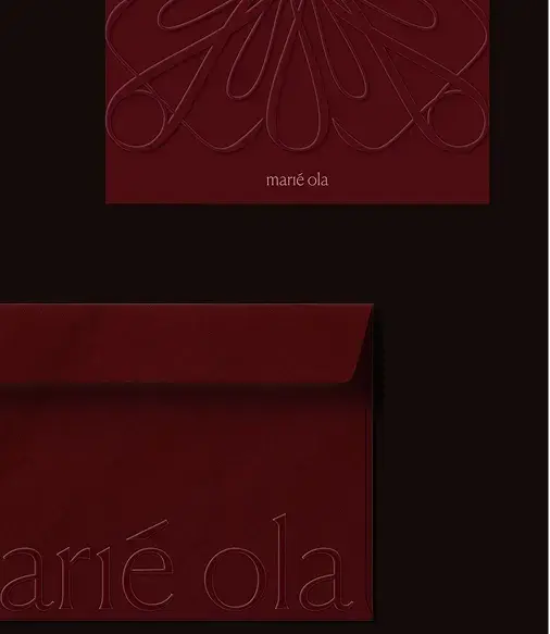
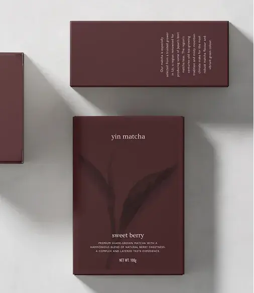
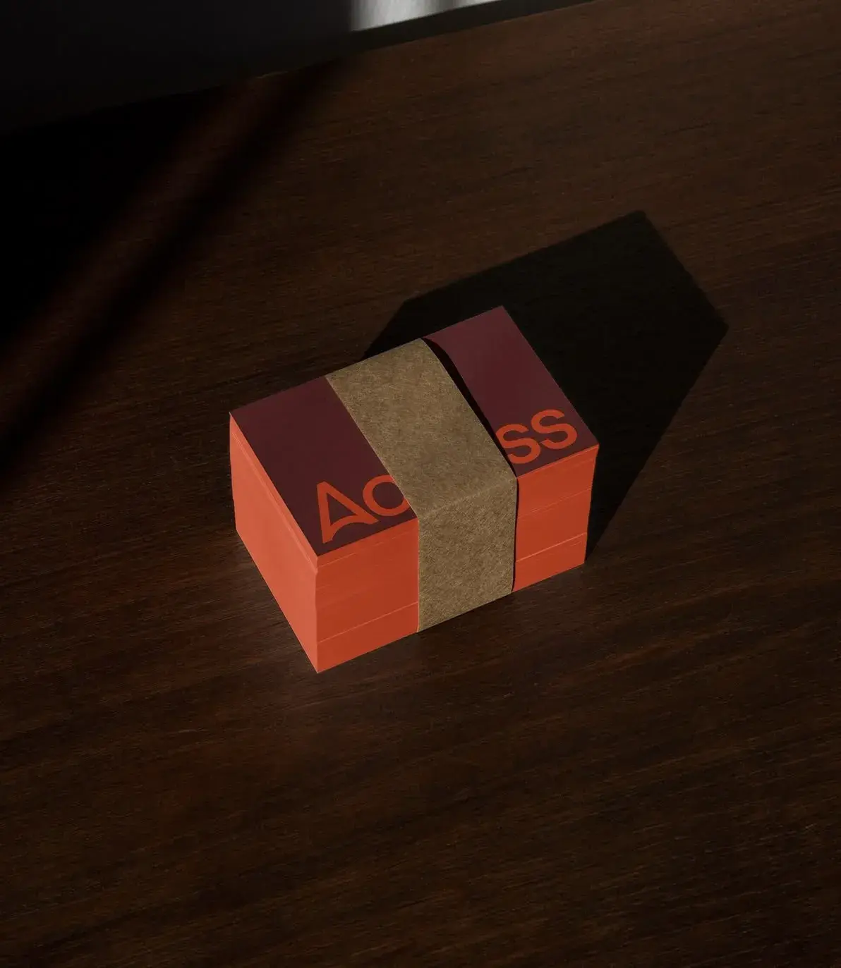
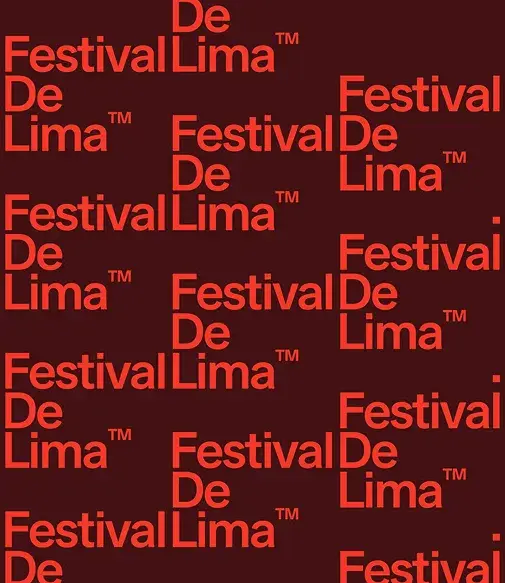
Not only is it a strong match with light blue, it also works beautifully with a pop of color like persimmon. The vibrant orange creates a striking contrast with the deep red, adding energy to the palette. It feels luxurious with a touch of playfulness, without losing its refinement. That tension between richness and vibrancy is what makes it linger.
PHOTO 03
PHOTO 04
Festival De Lima
COLOUR 04
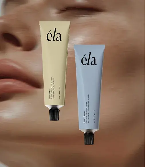
This colour feels friendly and subtly present. It brings softness and optimism into a brand, without becoming bright or childlike. Perfect for adding a sense of openness and accessibility to a palette. It introduces a gentle sense of warmth, making the overall brand feel more inviting and human without losing its refined edge.
PHOTO 01
EADEM
PHOTO 02
Wonder Studio
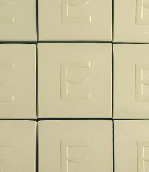
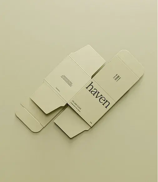
Soft yellow pairs naturally with light blue. Both are soft tones that enhance each other. The warmth of yellow and the freshness of light blue create a combination that feels light, accessible, and calm, with an energy that never becomes overwhelming.
PHOTO 03
ELISABELLESS
PHOTO 04
RiRi
colour O5
Persimmon brings a bold, sun-soaked energy into a brand. It’s vibrant and expressive, with just enough depth to keep it from feeling overly loud or overwhelming. There’s a richness to it that feels confident and warm, striking a balance between playful and refined. It naturally draws attention, while still leaving room for nuance.
PHOTO 1
Apoticari
PHOTO 02
Anna Claire Beasly
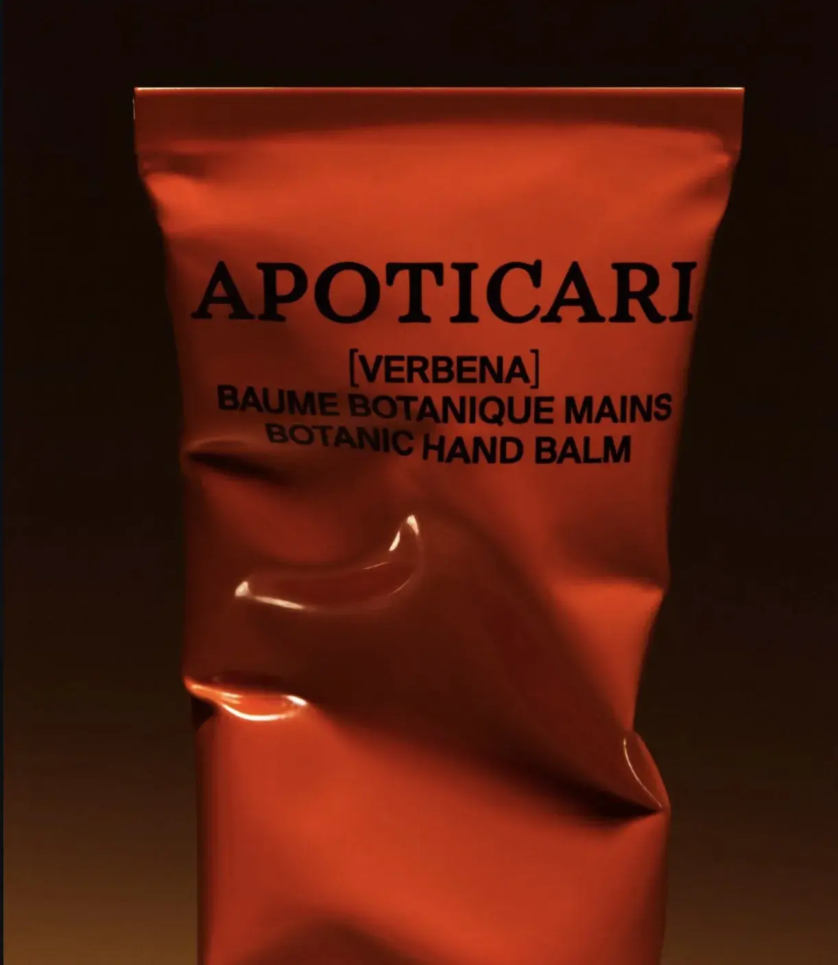
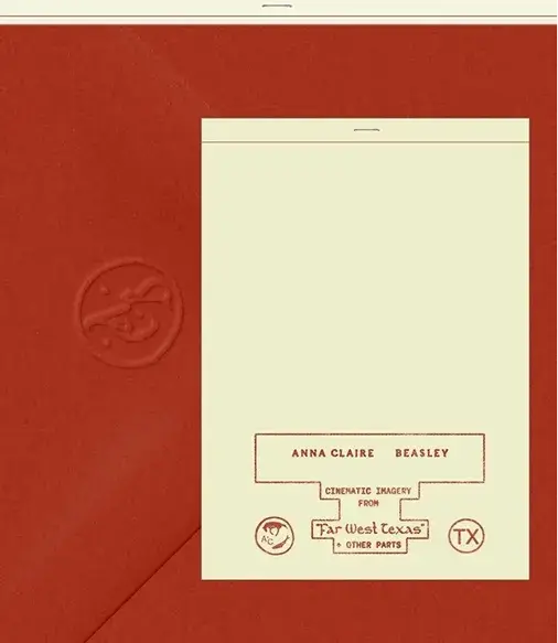
Paired with broken white, the palette gains breathing space. The brightness of persimmon is softened by the calm, understated quality of broken white, allowing the colour to stand out without dominating. Olive adds a grounded, earthy layer that brings balance and a subtle sophistication to the mix. Together, these tones create a palette that feels warm, characterful, and full of presence. Bold, but considered. Expressive, without losing its sense of balance.
PHOTO 03
Moksi
PHOTO 04
YDRA
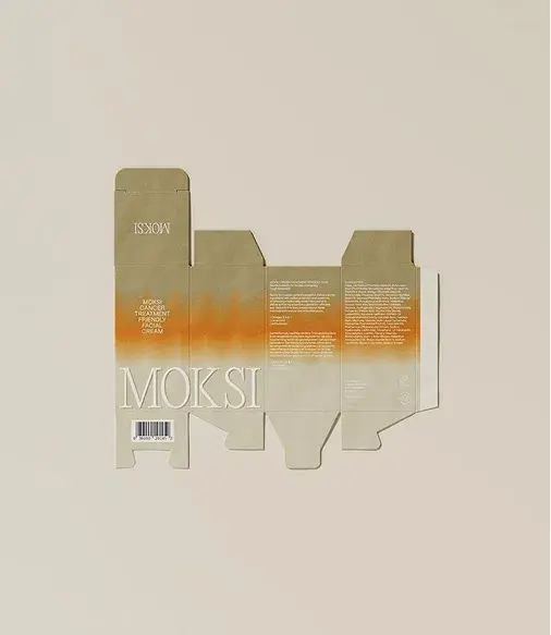
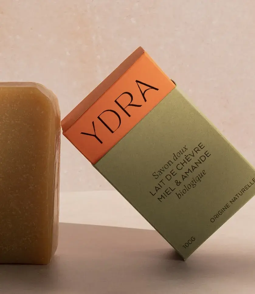
Feeling inspired to bring more intention into your brand’s colour and design? Book a call with us and let’s explore how we can shape a visual identity that actually feels like you.
As reading increasingly takes place on screens, the physical book is experienced differently — not for speed or convenience, but for its material presence: how it feels, how it behaves, how it ages through use.
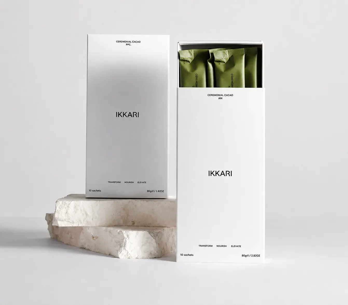
In a world dominated by screens and digital imagery, physical packaging is reclaiming its power as an experiential object. Consumers rarely encounter products only through online images — the first interaction often happens on the shelf, in the hand, or through subtle sensory cues.

Branding is often reduced to visuals. A logo. A colour palette. A font choice. Important, yes – but that’s only the surface. Real branding lives deeper. It’s the feeling people get before they’ve fully read your website. The confidence (or hesitation) they sense when they scroll your feed. The quiet click of recognition when something just feels right. Branding is not decoration. It’s direction.